Bully Max · Pet Nutrition App
The dog outgrows the order.
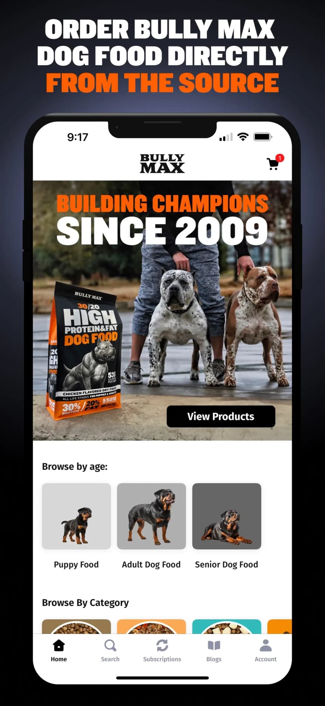
Bully Max sells dog food and supplements across every life stage. We launched their native iOS and Android app around that: a four-step plan builder, a catalogue that opens on the dog’s age rather than the product format, and subscriptions the owner edits themselves.
Project Scope
A puppy and a senior dog are two different customers.
A four-step plan builder, a catalogue navigable by life stage, the recurring price shown at the point of decision, and a subscription the customer can change without asking anyone.
The standing order outlives the plan it was based on.
Pet nutrition is one of the few categories where what the customer needs changes on a schedule everybody already knows. A puppy is a puppy for about a year. Then it is an adult for several years. Then it is a senior.
A standing order does not know that. It keeps sending what was right at signup, and the owner either finds where to change it or cancels. Most cancel — because cancelling is the one control that every subscription makes easy to find.
A subscription nobody can edit is just a cancellation with a delay.
What We Built
A native app built so the plan can be assembled, and then changed, without leaving the app or contacting anyone.
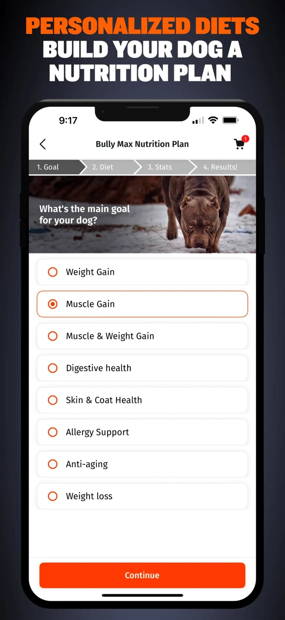
A Plan in Four Steps
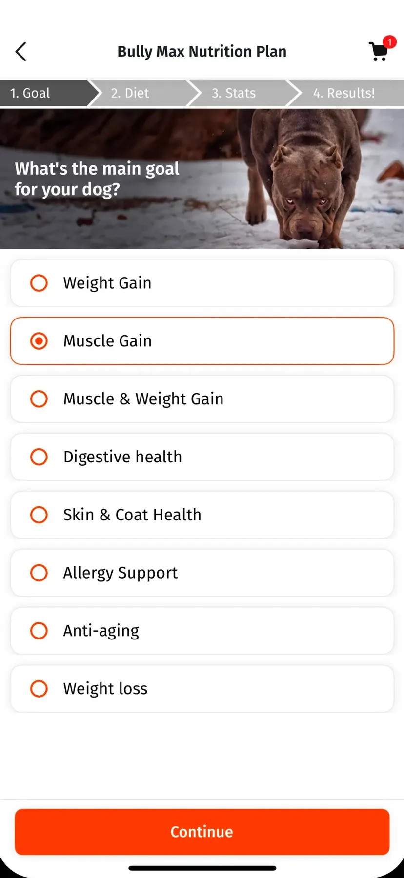
Goal, diet, stats, then a result.
The plan builder asks what the owner is working toward, what the dog eats now, and the dog’s own measurements, then returns a result. The four steps are labelled and numbered on screen, so someone can see how much is left before they start rather than discovering it halfway.
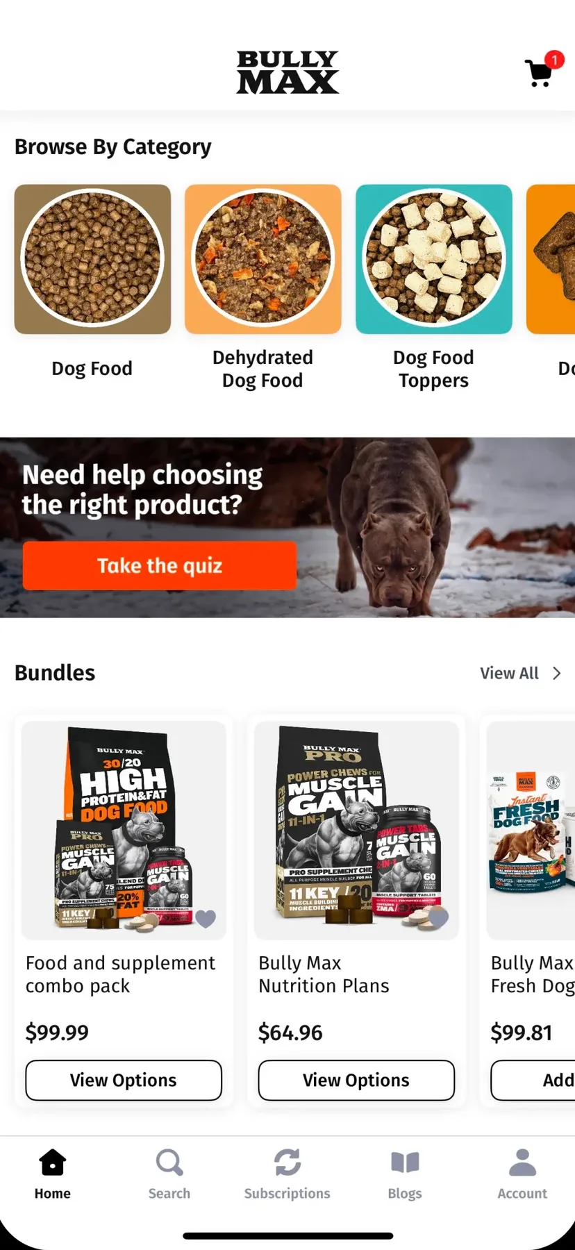
It is reached from a prompt inside the catalogue — “Need help choosing the right product?” — rather than an interstitial on launch. A customer who already knows what they came for is never made to answer questions first.

A Catalogue That Knows the Dog’s Age
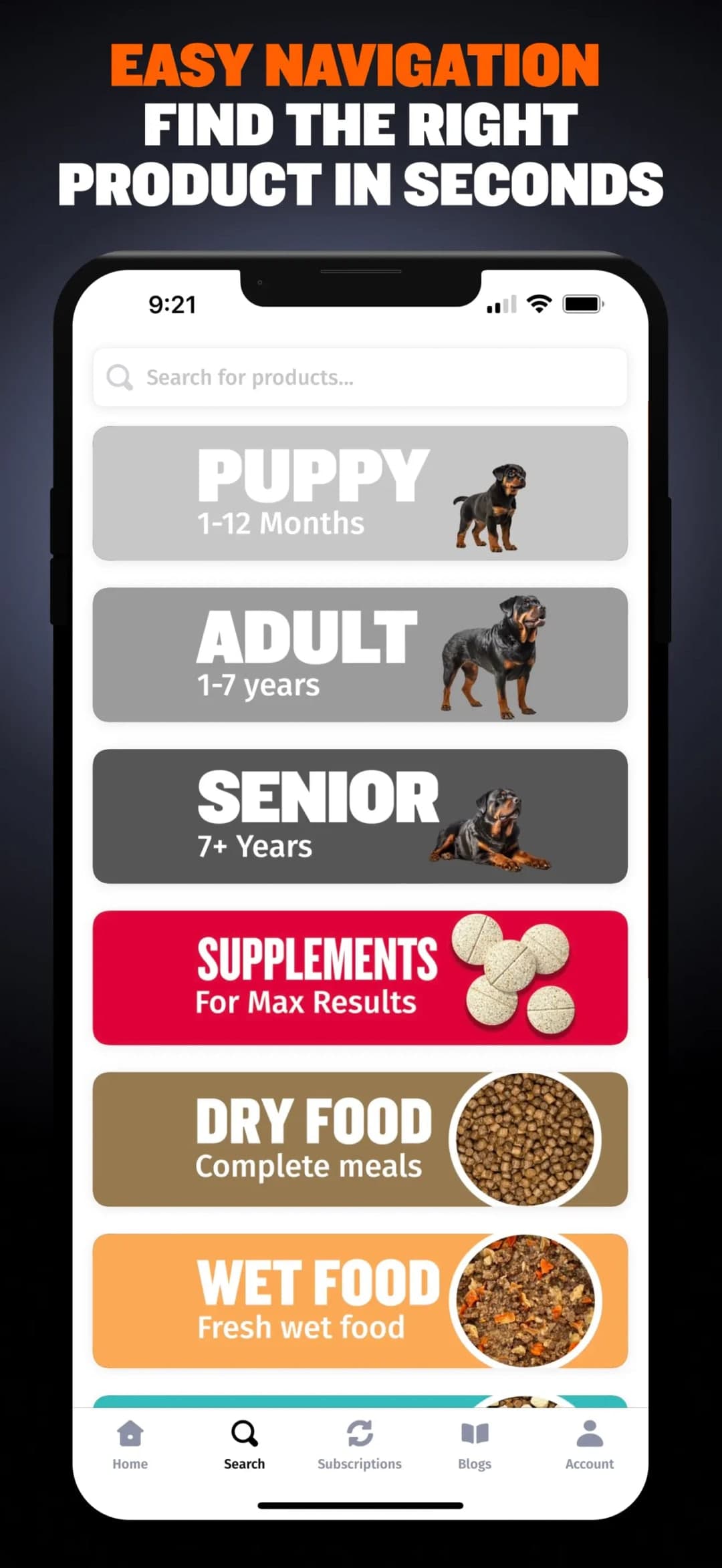
Puppy, adult and senior are top-level.
Search opens on life stage — puppy, adult, senior, each with its age range stated — above the food formats. The axis along which a customer’s requirements actually change is the first thing the navigation offers them.
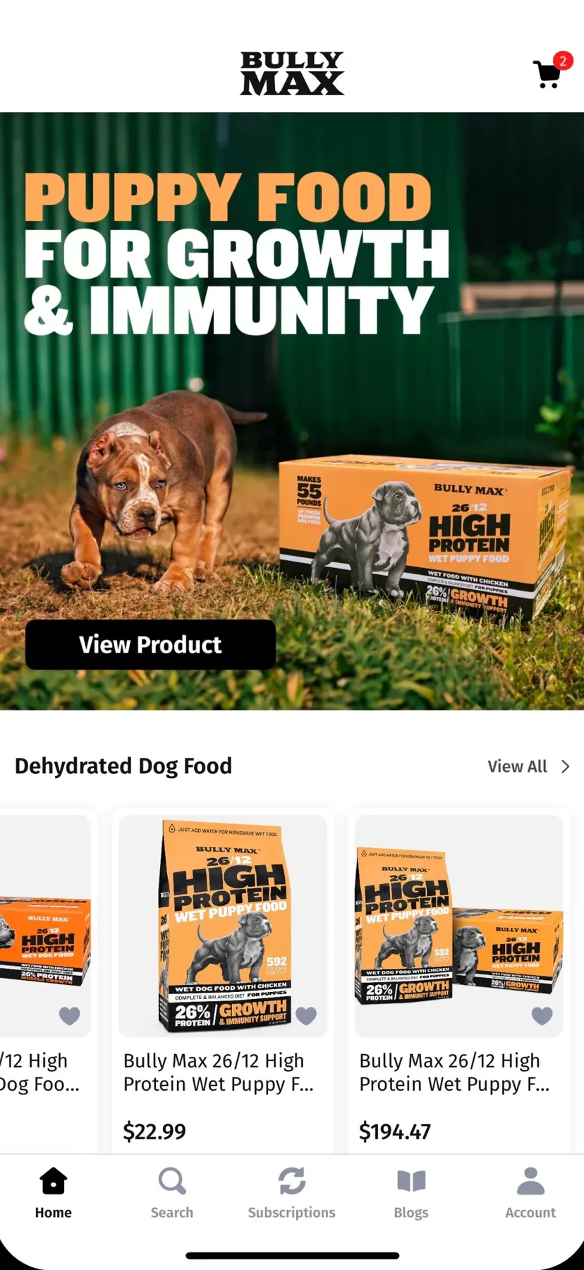
The home screen repeats it: browse by age sits above browse by category. An owner whose dog has had a birthday has somewhere obvious to go, which is the moment a pet subscription is most often lost.

The Recurring Choice, Priced in Place
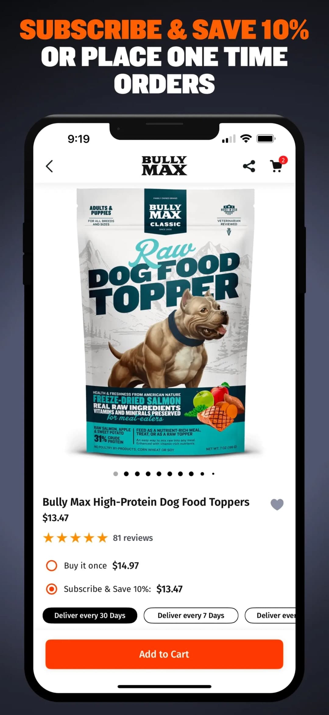
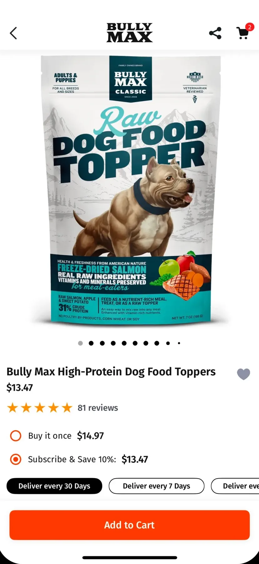
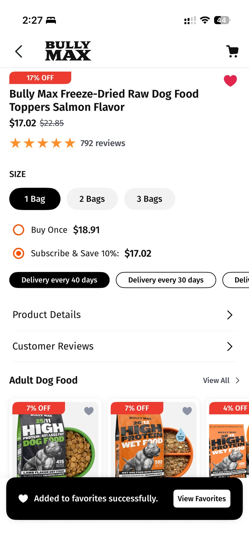
Buy once or subscribe, on the same screen.
The product page puts the one-off price and the recurring price next to each other, with the delivery interval selectable beside them. The customer decides once, rather than discovering the subscription option after checkout or not at all.
Ratings sit on the same screen, so the case for buying and the reassurance about buying are not a page apart.
A Subscription the Owner Can Actually Change
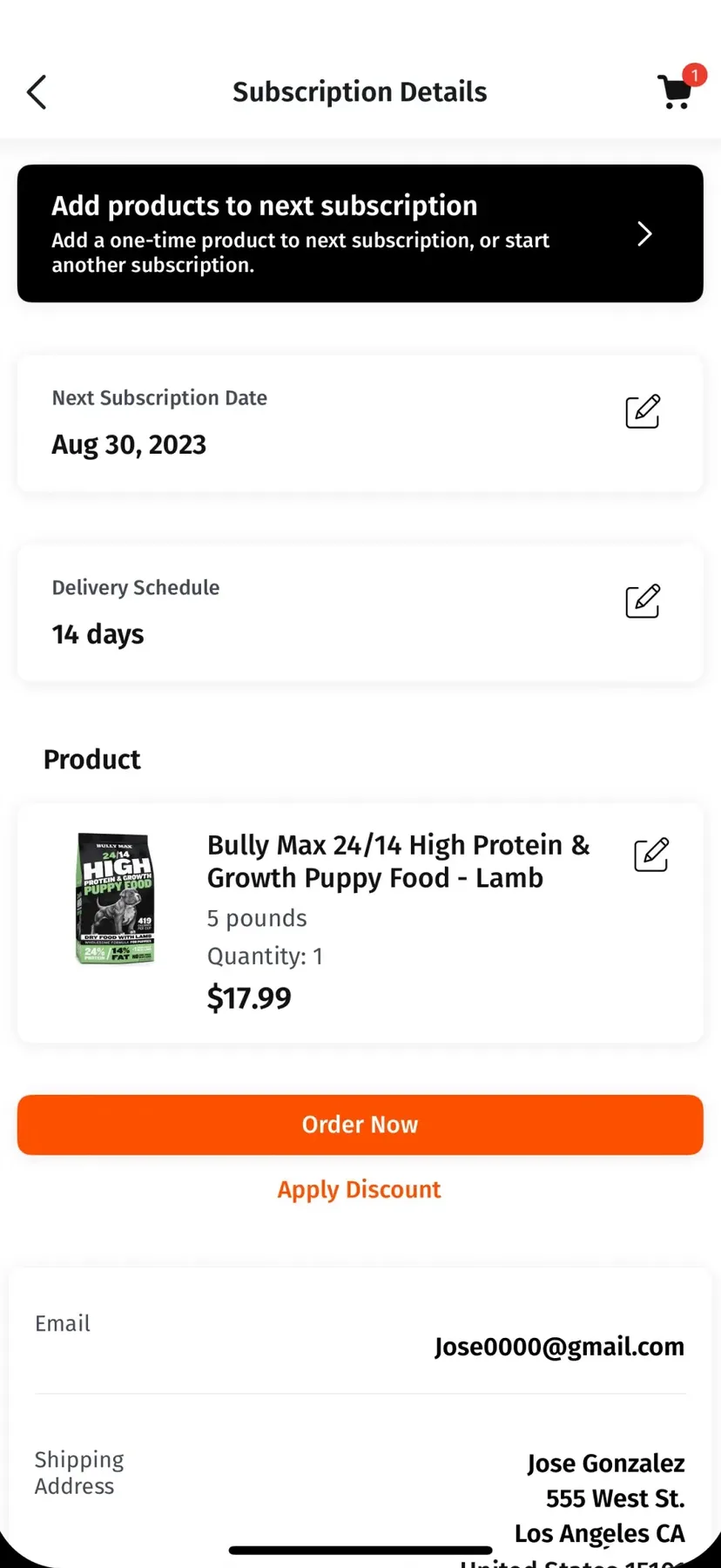
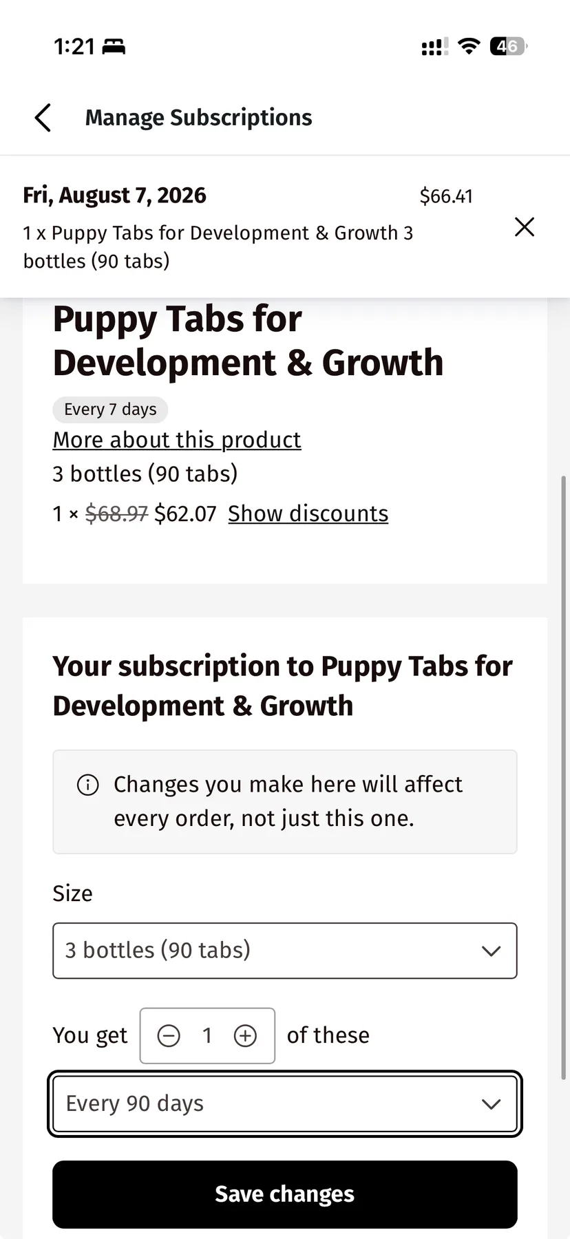
Edit the next order, or pause it.
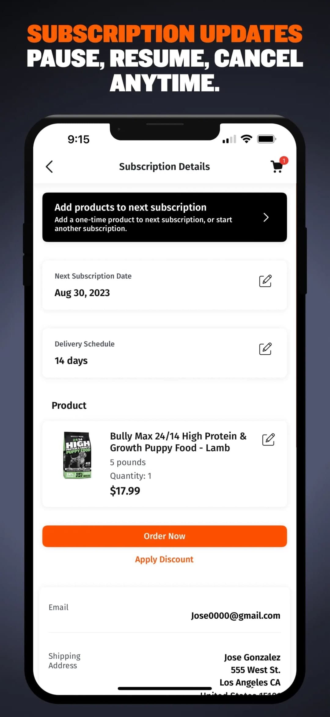
The subscription screen exposes the next delivery date, the interval and the products on it — each editable in place — and allows adding a one-time product to the next shipment without starting a second subscription.
Pause, resume and cancel all sit together. Making cancellation easy to find is not a concession: it is what puts pause in front of the customer at the moment they were going to cancel.
The edit sheet carries the controls that claim depends on — pack size, how many, how often — and states plainly that a change applies to every future order rather than just the next. That sentence is the difference between a customer editing confidently and a customer cancelling to be safe.
Points That Buy Gear, Not More Food
A balance, ways to earn it, and the next reward named.
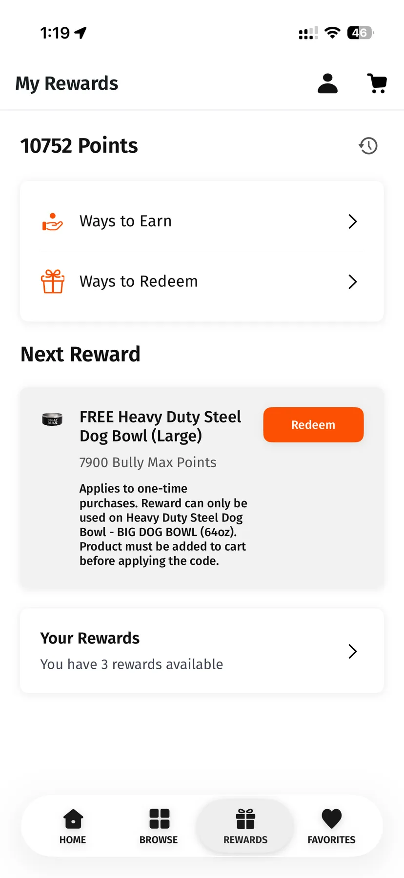
Rewards sit in the primary navigation with the balance at the top of the screen, split into ways to earn and ways to redeem. The screen names the next reward within reach and what it costs, so the balance reads as progress toward something rather than as a number.
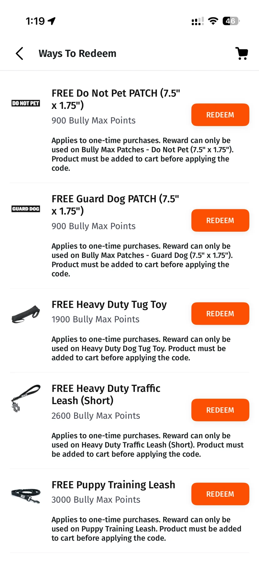
What the points buy is gear — patches, leashes, a tug toy, a bowl — rather than more of what the subscription already delivers. A loyalty scheme that discounts the thing already on subscription teaches customers to wait for the discount; one that pays out in equipment does not.
Something to Read Between Deliveries
A learning centre and press releases, in the app.
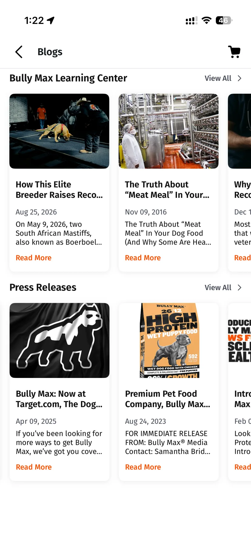
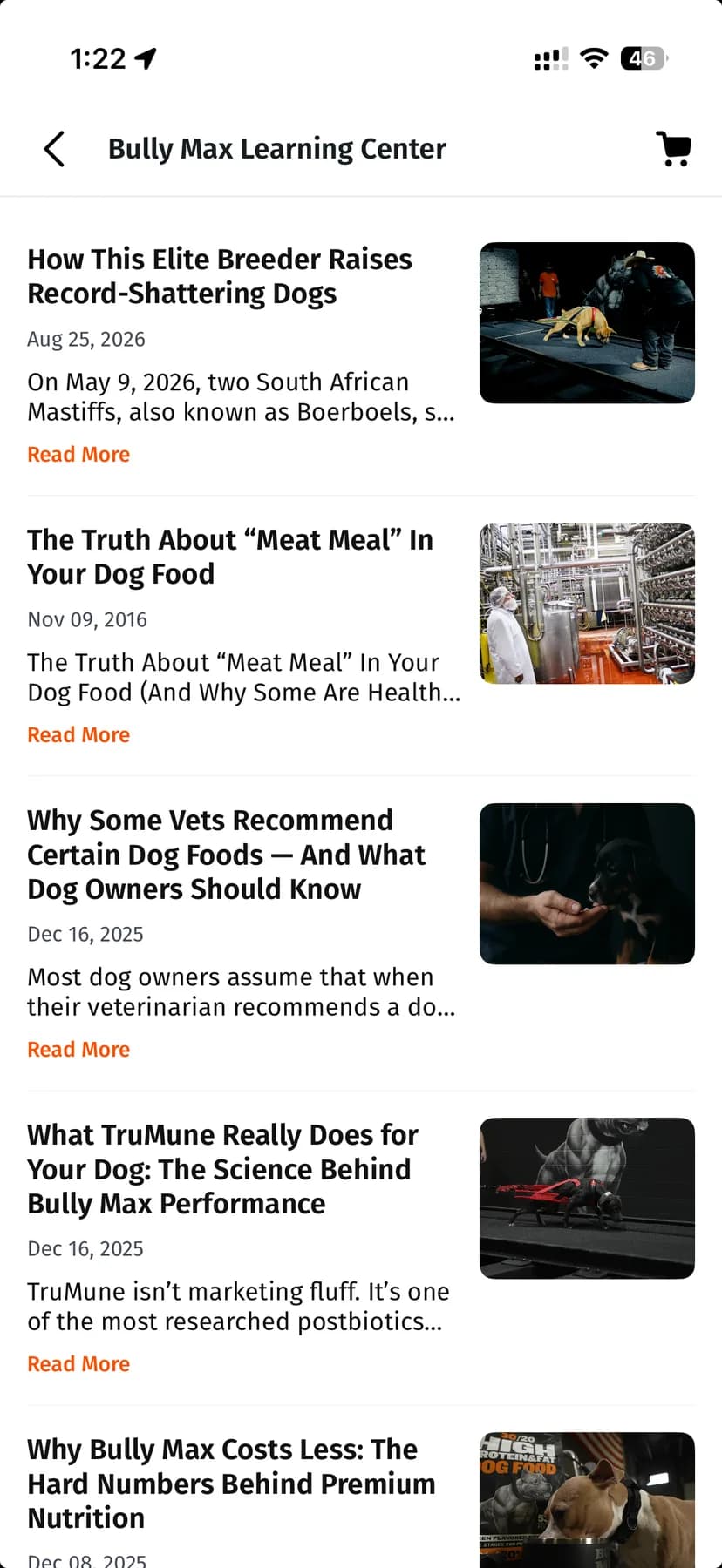
The brand publishes at length, and the app carries that library rather than linking out to it: a dated article index, alongside a separate press release feed.
For a business whose customers buy the same thing repeatedly, this is the only part of the app with a reason to look different between orders. A shop someone has already chosen from has nothing new to show them; a library does.
Search That Answers, Not Just Matches
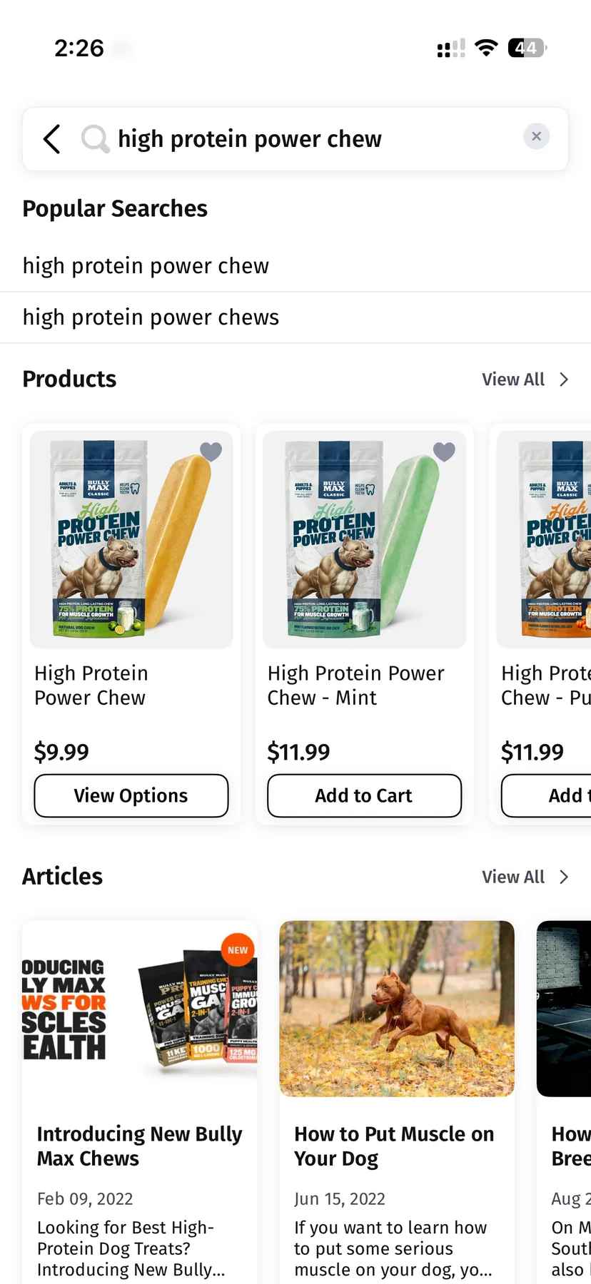
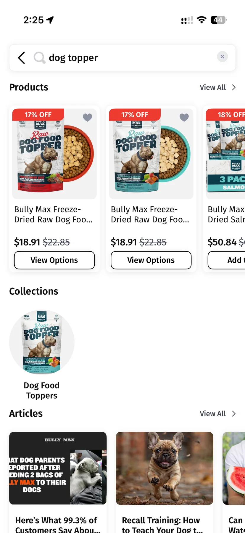
One query returns products, collections and the brand’s own writing.
Searching returns three kinds of result together: matching products, the collection they belong to, and articles from the library. Someone who types a term they half-remember gets the item, the group it sits in, and the writing that explains it, without running three separate searches.
Recent and popular queries are offered before anything is typed. For a catalogue people buy from repeatedly, the fastest search is the one that remembers what was searched last time.
Everything Else in the Same Place
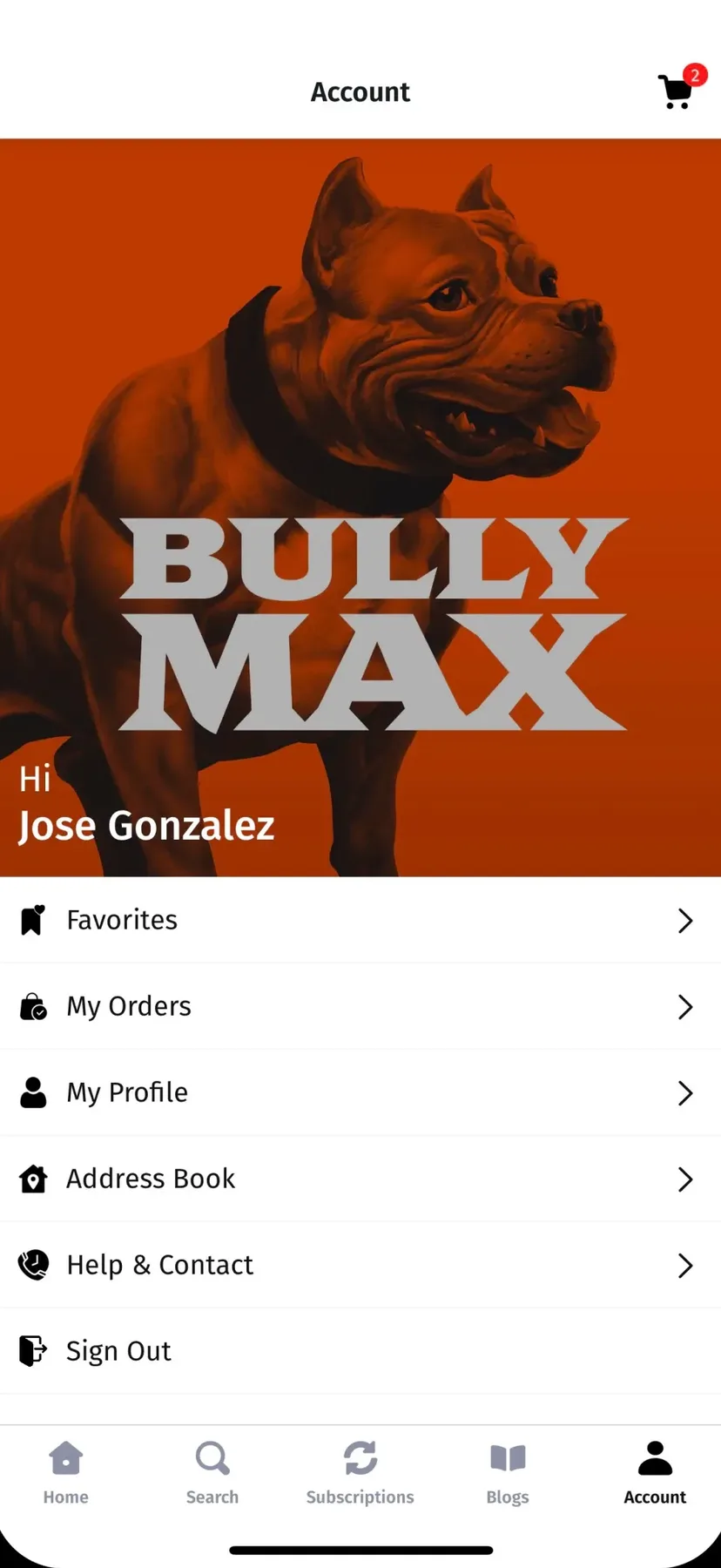
Cart, favourites, account and support.
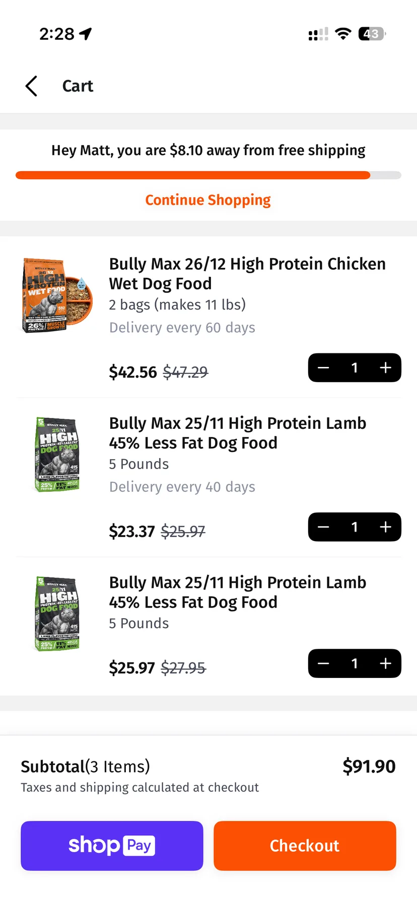
The cart states how far the basket is from free shipping rather than leaving the customer to work it out, and carries each line’s own delivery interval, so a basket of several subscriptions is legible in one place. Checkout runs through the wallets customers already have.
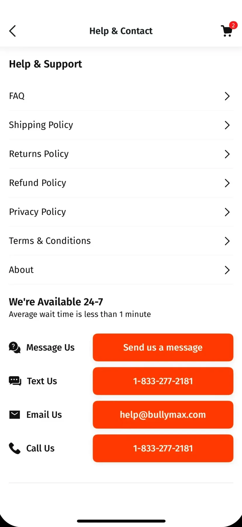
Support offers four routes from one screen — message, text, email, call — with the current wait stated rather than implied. On a repeat-purchase brand, the question is rarely “what is this”; it is “where is mine”.
The Outcome
Bully Max ships on the App Store and Google Play, with the plan builder, life-stage navigation and self-service subscription controls in one app. The mobile channel added revenue rather than moving it off the web storefront.
- Mobile
- Native app launched
- iOS + Android
- Both platforms shipped
- Self-serve
- Subscriptions changed without support
Does your standing order know the customer has changed?
Bring the range, the subscription logic, and whatever your support inbox is full of. We will start wherever a customer cannot change their own order.