Organics Ocean · Supplement Commerce App
A short range has to earn its place differently.
Organics Ocean sells a deliberately small number of supplements. A short range cannot compete on shelf space, so the app makes it compete on how well each product is explained. We launched theirs on iOS and Android.
Project Scope
Fewer products, so each one has to answer more questions.
Subscription pricing at the point of decision, reviews under the product, search that returns explanations as well as items, and notifications customers opt into.
A short range looks thin in a grid.
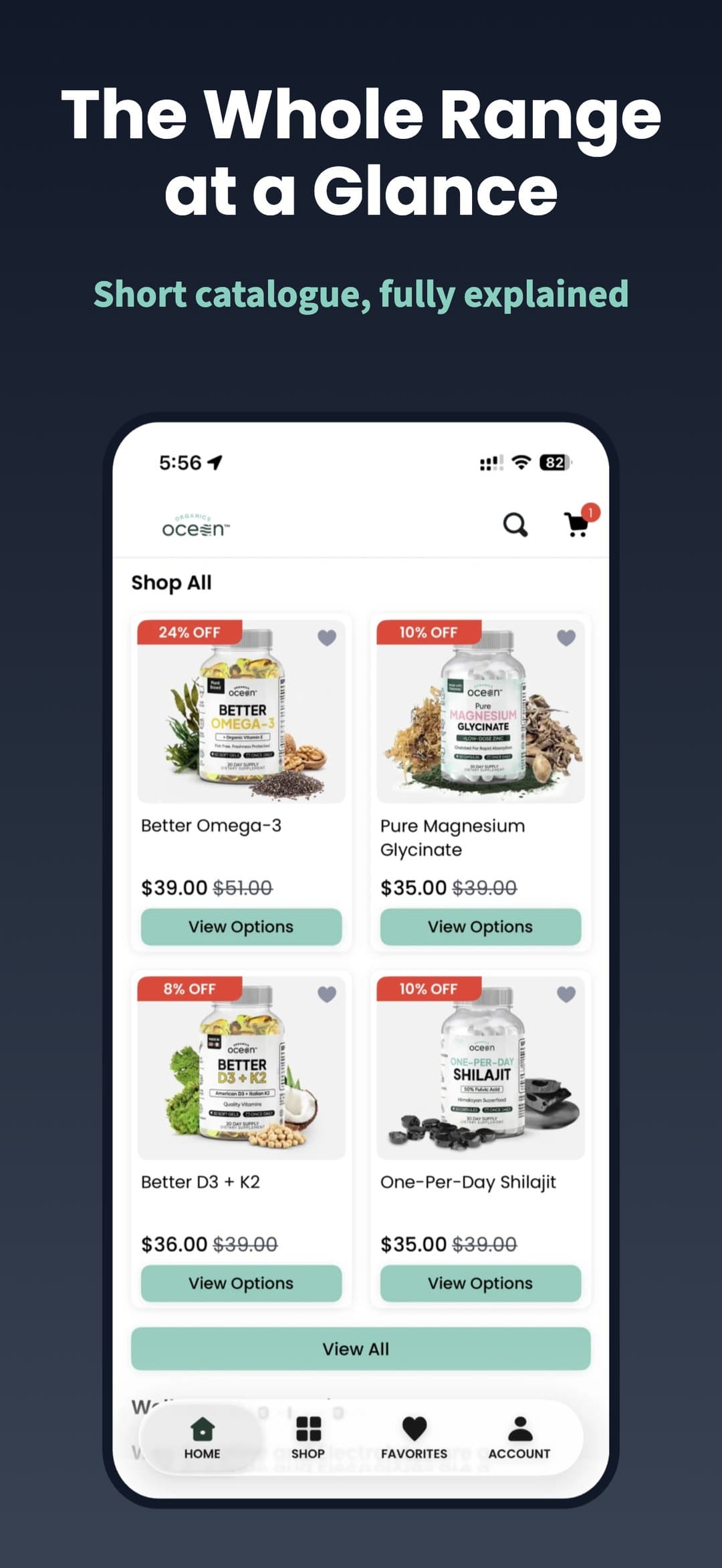
Put six products in a scrolling grid and the catalogue reads as small. The customer sees the end of the list quickly and has no more reason to stay than they had to arrive.
The advantage of a short range is the opposite of what a grid shows: every item can be properly explained, compared and stood behind. None of that survives being reduced to a tile with a price.
A short range is a reason to explain more, not a reason to show less.
What We Built
A native commerce app built so each product carries its own case, and the range is browsable, searchable and subscribable without leaving it.
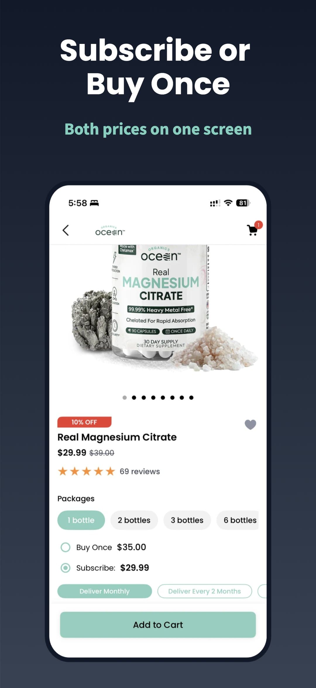
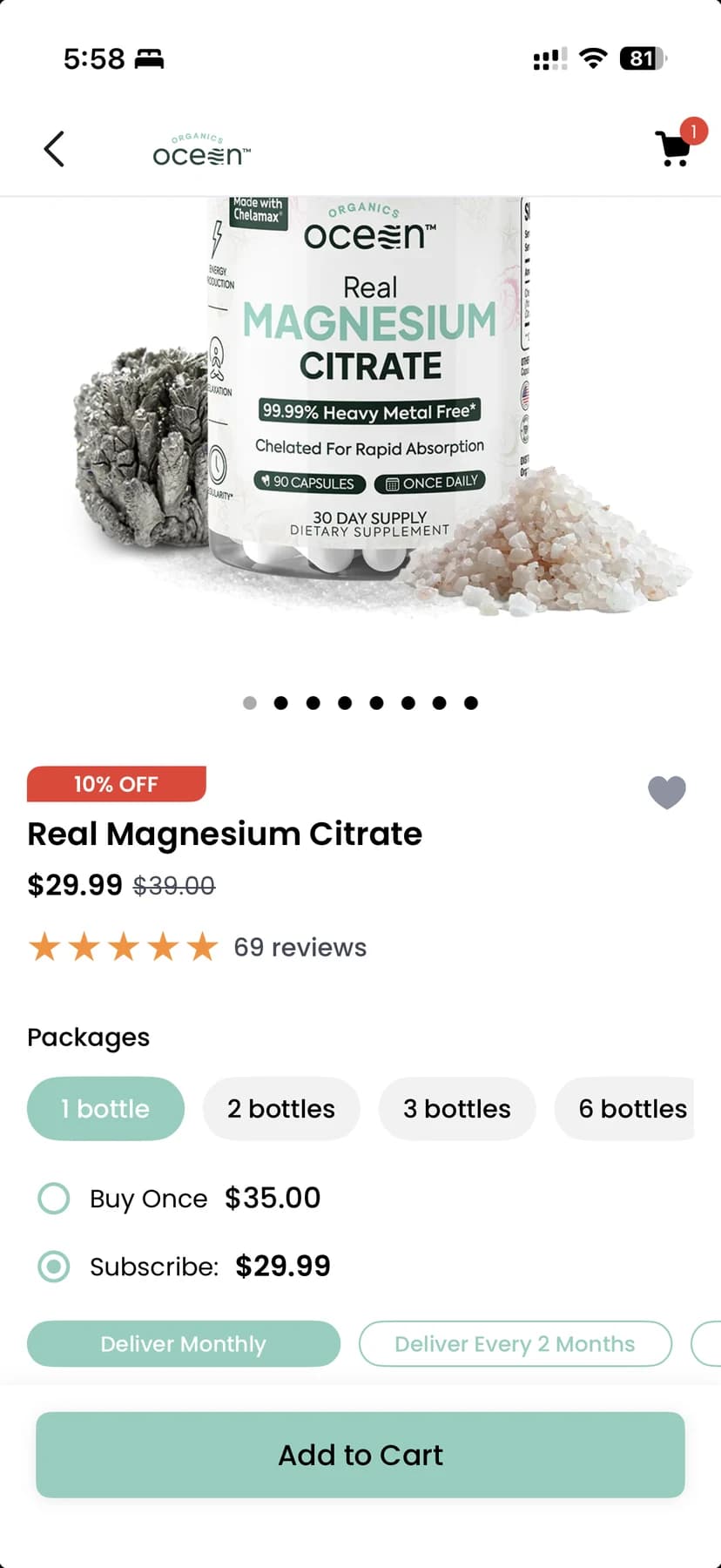
Subscribe or Buy Once, Side by Side
The recurring choice at the point of decision.
The product page puts one-off and subscription pricing next to each other, with delivery cadence and multi-bottle packages on the same screen. The customer decides once instead of discovering the subscription later.
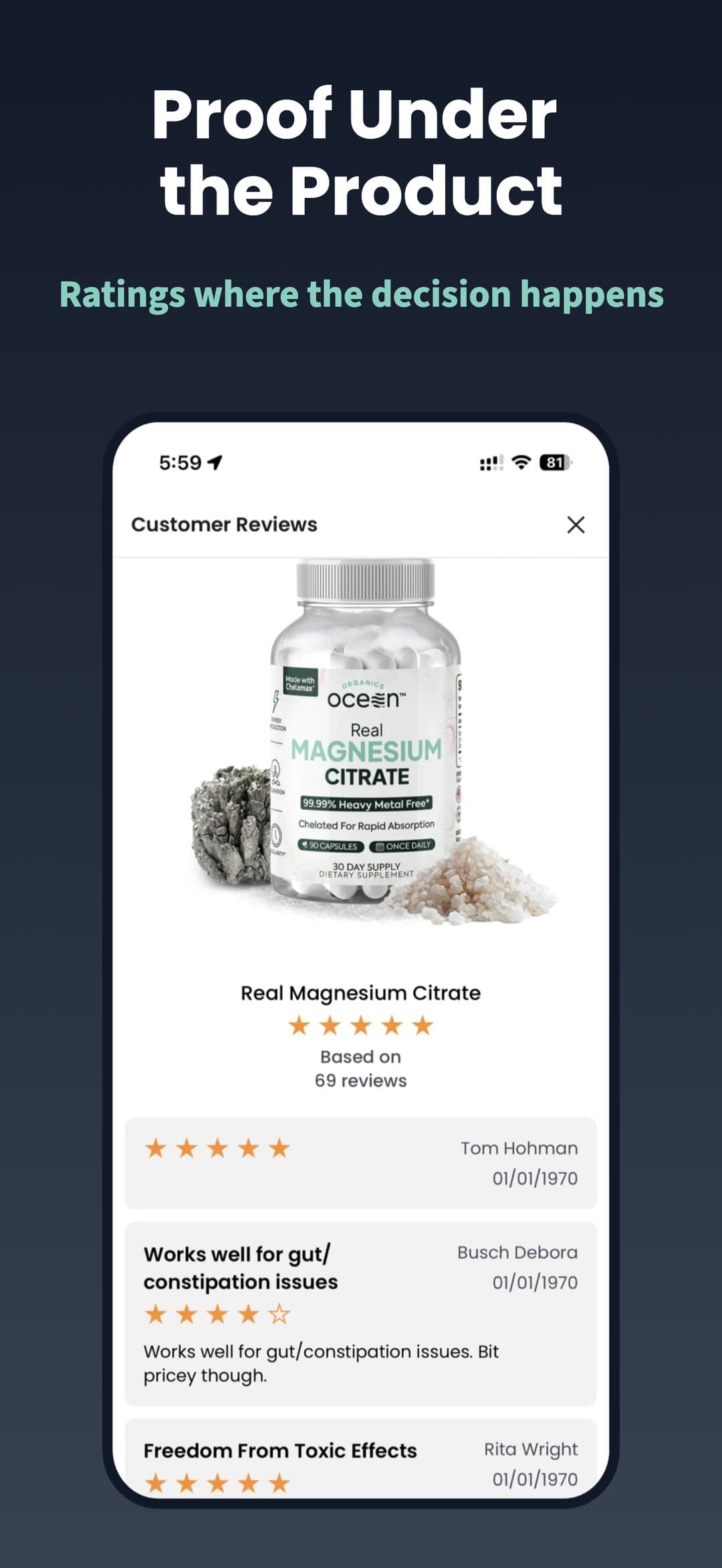
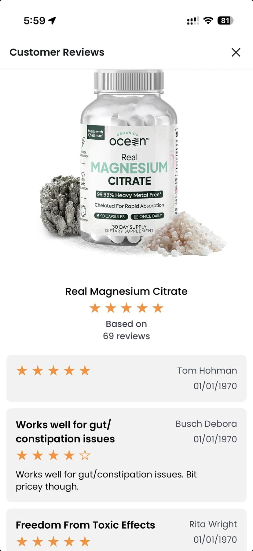
Ratings and reviews sit under the same product, so the case for buying and the reassurance about buying are not on separate pages.

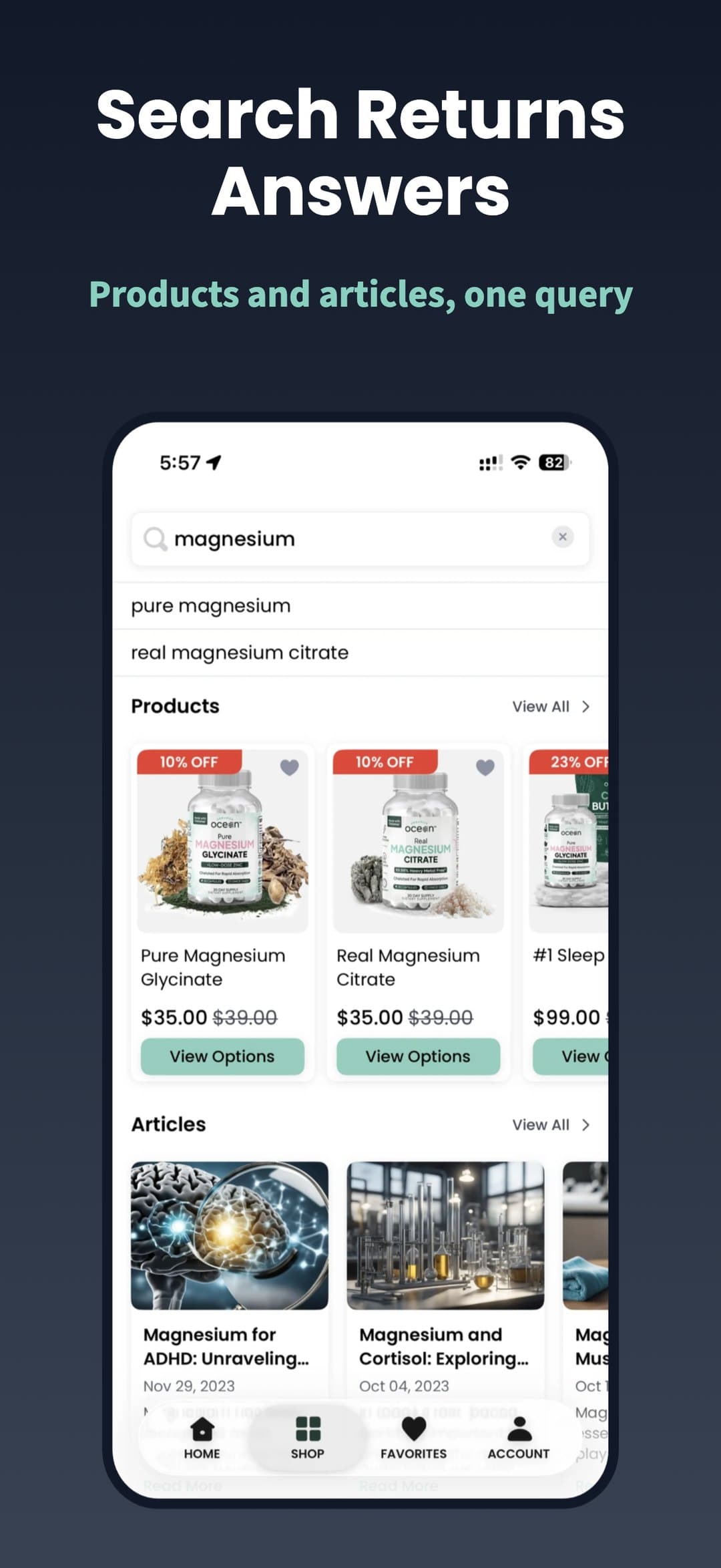
Search That Returns Explanations Too
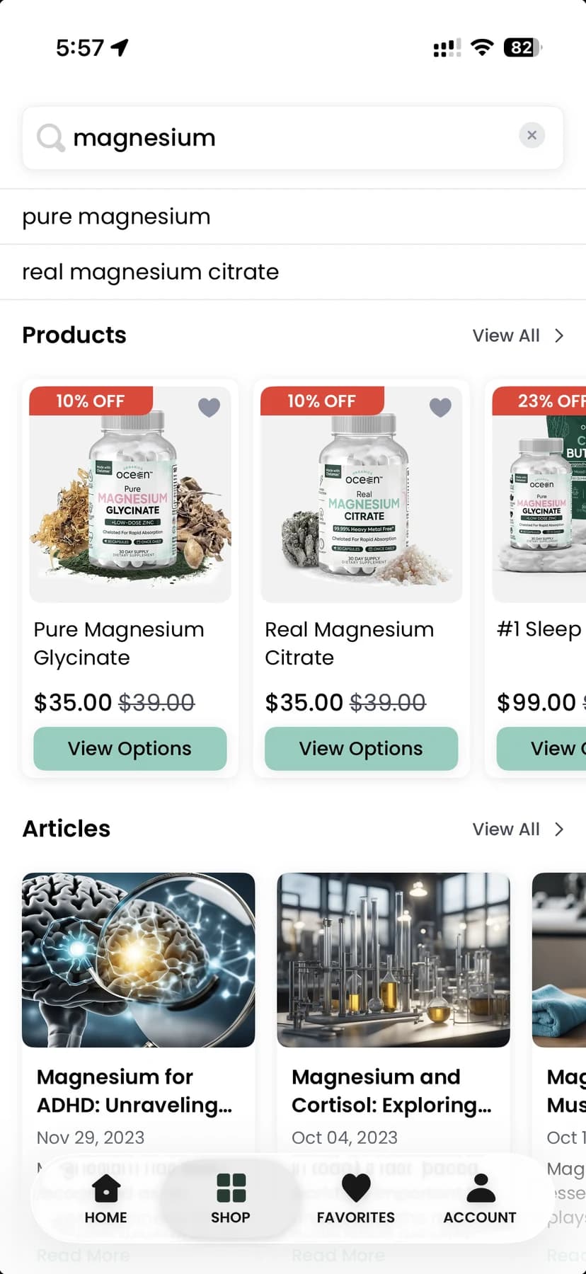
One query, products and articles.
Searching the app returns matching products and the brand’s own articles in the same result. Someone typing an ingredient name gets both the item and the writing about it.
For a short range this matters more than it would for a large one: most questions are about whether a product is right, not about which of forty to pick.
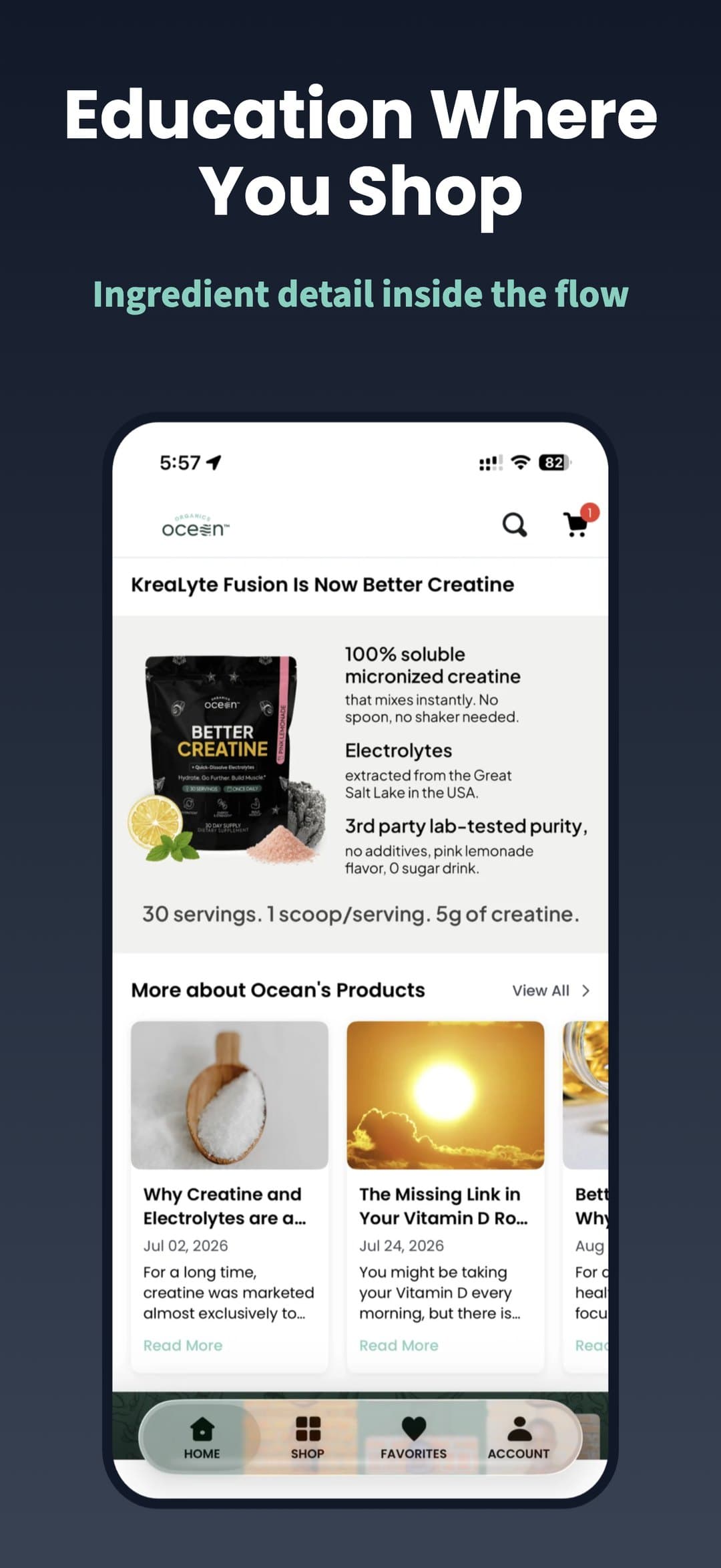
Education Where the Product Is
Ingredient detail and articles inside the shop.
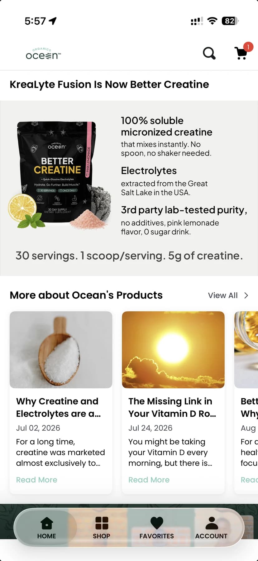
Product explainers and the brand’s article library sit inside the shopping flow rather than in a separate content section, so the reading and the buying happen in one place.
The Whole Range, Two Ways
A visual grid and a plain list.
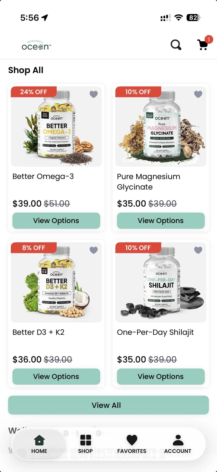
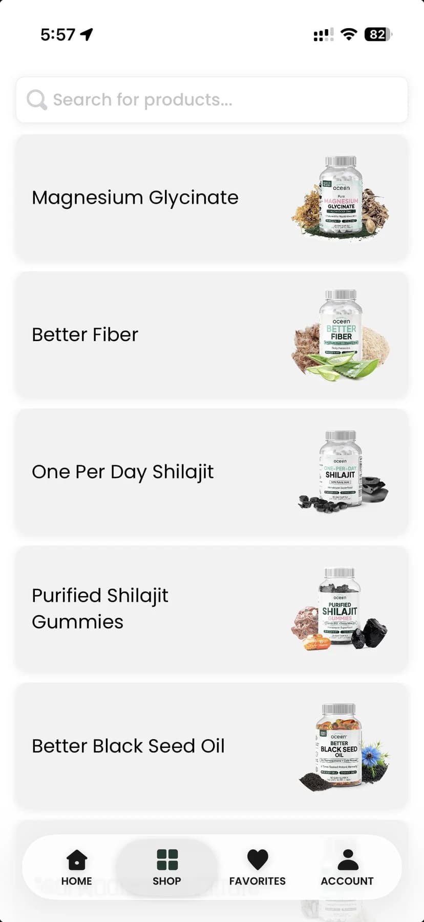
The range is browsable as a grid with pricing and saved favourites, and as a plain list for customers who already know the name of what they want.
With a short catalogue both views fit comfortably, which is the one merchandising advantage of not selling everything.
Notifications People Opt Into
Asked for, not assumed.
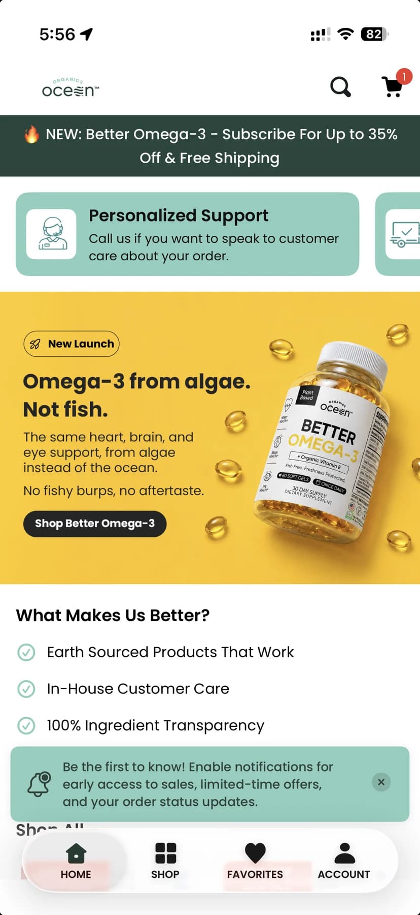
The app asks for notification permission by saying what it will send — early access, limited-time offers and order status — rather than prompting on launch and hoping.
Alongside it, in-house customer support is offered directly from the home screen for anyone who would rather talk to someone.
The Outcome
Organics Ocean ships on the App Store and Google Play, with subscription pricing, reviews, search and the article library in one app. The mobile channel added revenue rather than moving it off the web storefront.
- Mobile
- Native app launched
- iOS + Android
- Both platforms shipped
- Subscribe
- Recurring pricing at the decision
Is your range small, or just described as though it were large?
Bring the catalogue and whatever you have already written about it. We will start by putting the two in the same place.