Concept Walkthroughs
The buy box starts two screens down
 Ratik3 min read
A fictional product page rebuilt so the gallery, rating, purpose and cart all arrive before the first scroll, and a walkthrough of what the old page made a customer do first.
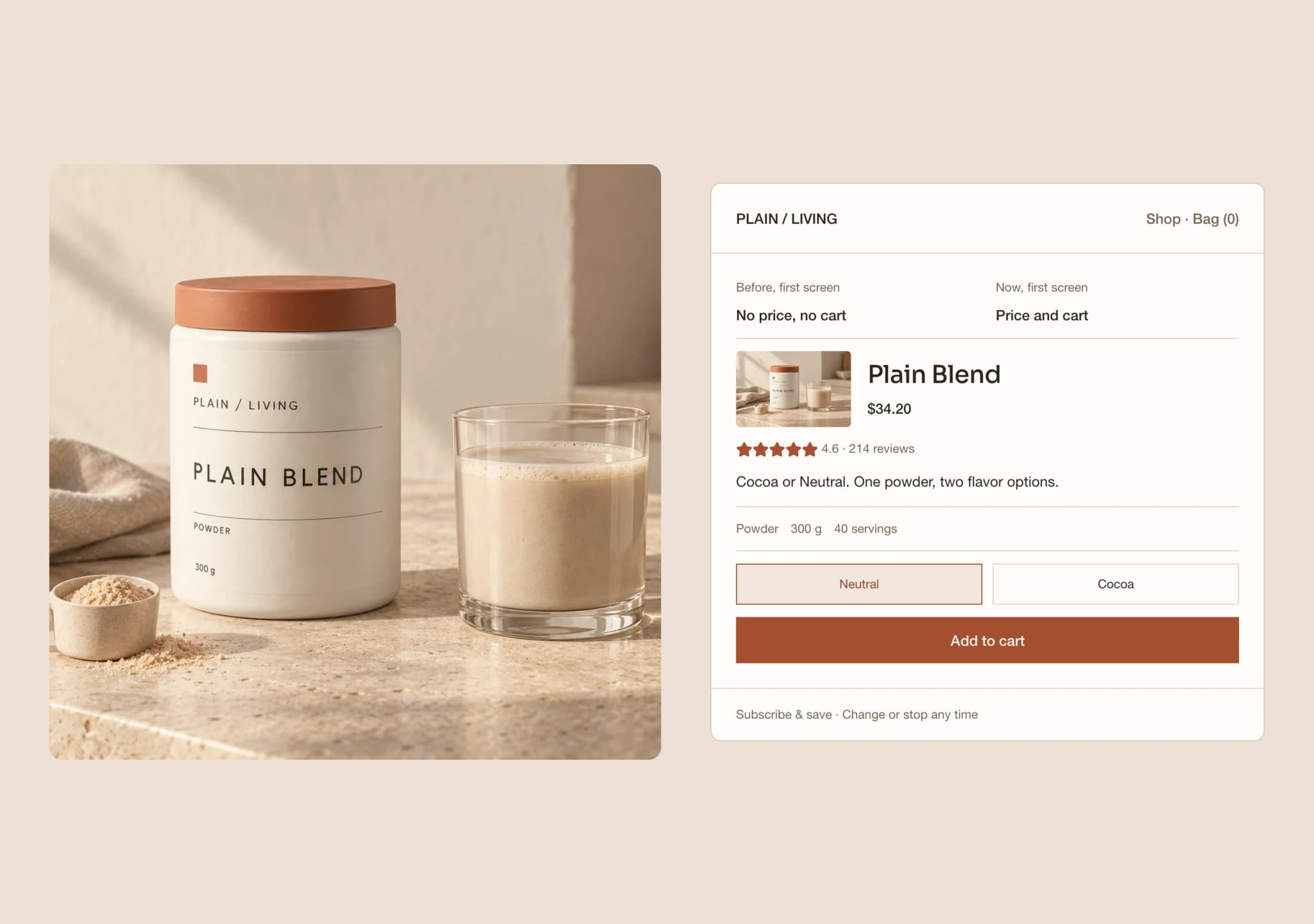
Open a supplement product page on a phone and count the screens before you can buy. On a lot of stores the answer is two or three. A promotional countdown sits above the product. The gallery arrives, then a paragraph of description, then the ingredients, and somewhere past all of it the price and the add-to-cart button finally appear.
The Product Page is a fictional concept built on a made-up store called PLAIN / LIVING. It demonstrates a storefront interaction locally. It is not a client launch, and it reports no measured conversion result. Nothing is purchased, no payment is taken and no account is created.
Put the decision in the opening viewport
The rebuilt page opens on the gallery, the product name, the rating, one line on what the product is for, and an add-to-cart control docked from first paint. Nothing there is new information. It is the same material the old page carried, ordered so the customer can decide without hunting.
The rebuilt page uses a short promotional bar to state the subscription saving. It replaces the countdown with information relevant to the buying decision.
You can switch between the current page and the rebuild inside the demo. The comparison is the point. A rebuilt page on its own looks tidy; beside the page it replaces it makes an argument.
Price both ways to buy in one block
Subscription pricing often lives in a different part of the page from the one-time price, which asks a customer to hold two numbers in their head and scroll between them. The concept puts quantity, plan and price in a single block, with the subscription saving stated next to the price rather than in a badge somewhere else.
Changing the flavor, the plan, the delivery interval or the quantity updates the docked price immediately. The button stays on screen throughout. That is the whole mechanism, and it is worth testing by hand rather than imagining from a screenshot.
The bag is inspectable inside the phone. You can add a line, look at it, remove it and continue shopping. Buy opens the purchase controls; Details opens the product facts. Switching views keeps your selections, and the phone keeps its proportions while the current view scrolls.
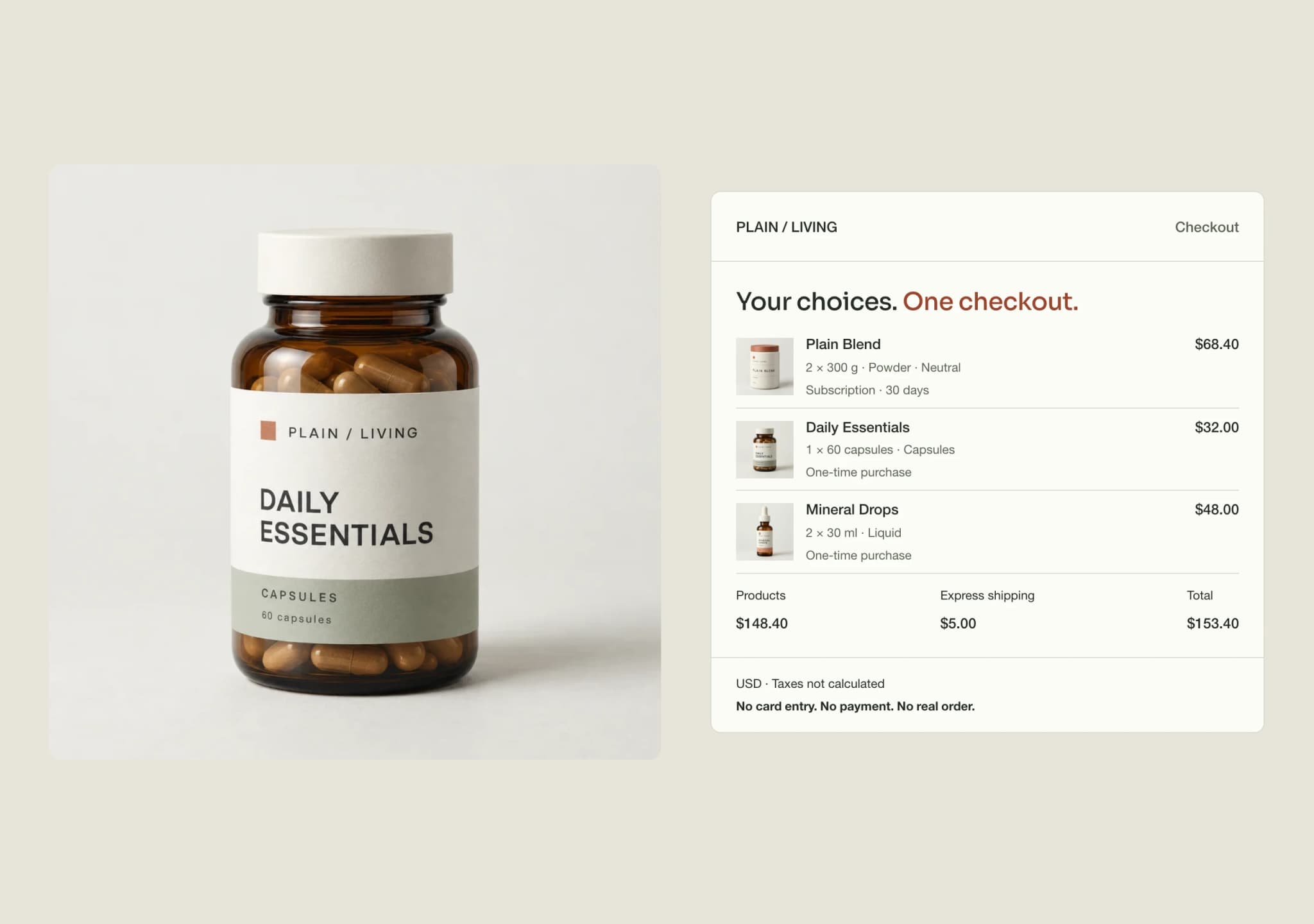
From the bag, open the order review and confirm it to see a local receipt. The receipt retains the reviewed items and subtotal, while confirmation clears the bag. No payment is taken, no order is placed and no subscription is created.
Keep product details easy to reach
Details opens at serving size, servings per canister, format and net weight. Preparation, flavor and storage information remain one tap away in expandable panels. Three expandable questions follow the product facts; they start closed until you choose one.
The fictional catalog publishes format, size, flavor and price. It does not supply a full ingredient panel, a testing certificate, a country of origin or an allergen statement. A real implementation needs that verified information before launch; this concept does not invent certifications or health outcomes.
The rating and reviews are illustrative, disclosed outside the storefront so the interface reads like a shopping experience. Every related product shows its price on the card, because a related product without a price is an invitation to a second click rather than a second purchase.
Source: Adobe: AI traffic grows but retail sites lag in AI search visibility
What production would need
A real build starts from the store’s own catalog rather than three fictional products, and the ordering questions get harder as the range grows. Purchase terms need the store’s actual subscription policy written into them. Reviews need a real source, named and linked.
The page also needs its own measurement before anyone claims it works. A rebuilt product page is a change to the buying decision, and the honest way to evaluate it is a comparison against the page it replaced, over a window agreed before the test rather than after the chart looks good.
This concept demonstrates an interaction. It does not establish that the interaction sells more, and the demo does not pretend otherwise.
What would this look like for your brand?
Talk directly with a founder about one customer journey, the systems behind it and a focused prototype using your approved products and content.